Boxed | Brand Identity & Packaging
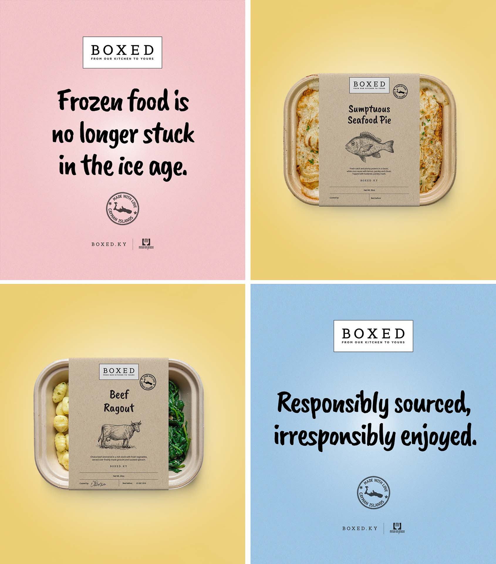
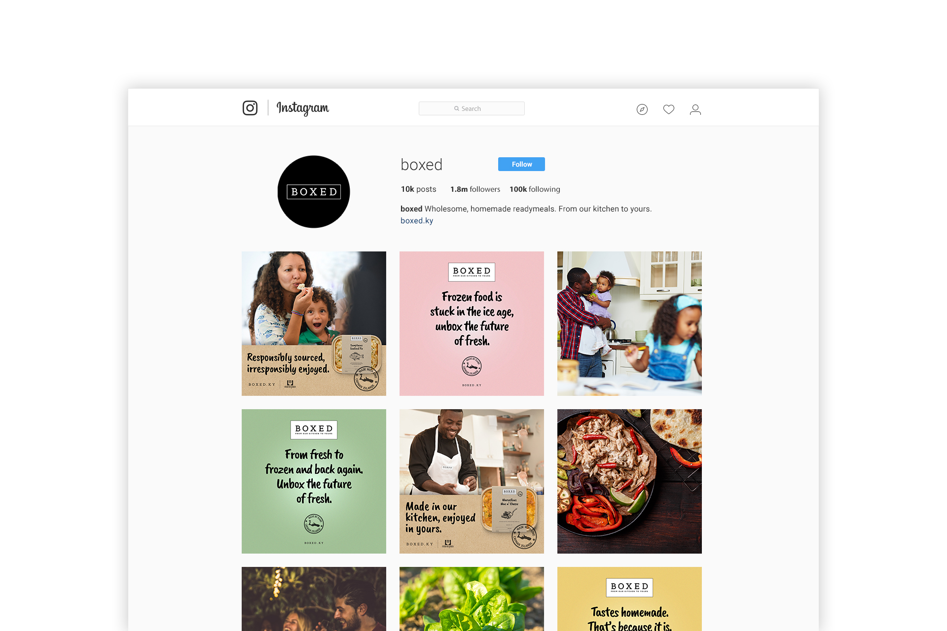
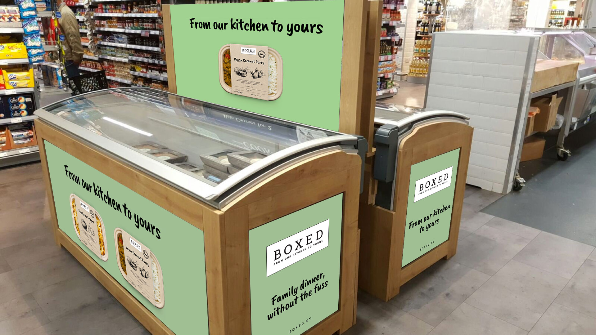
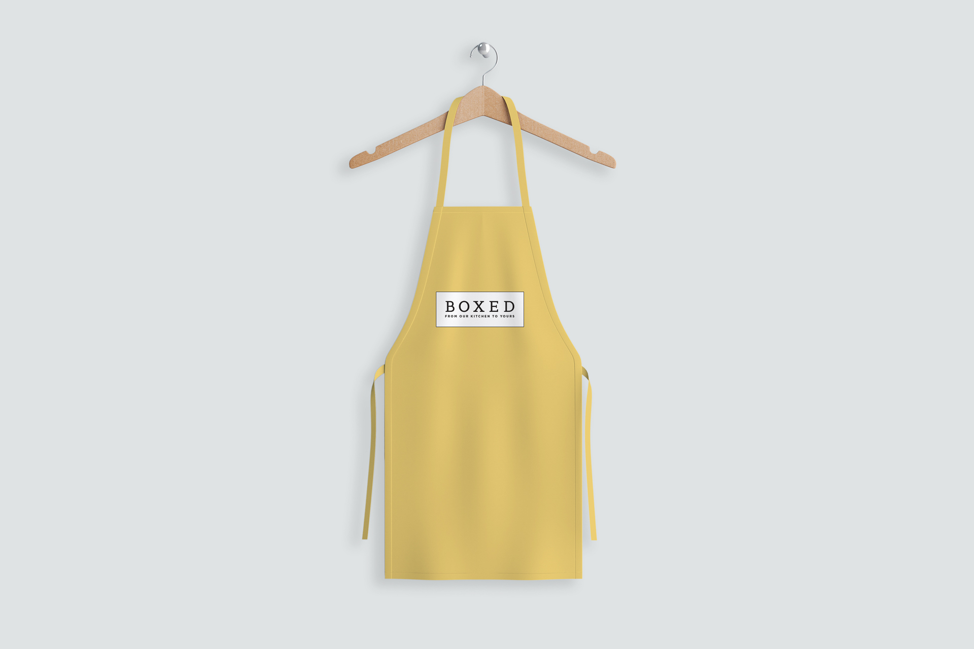
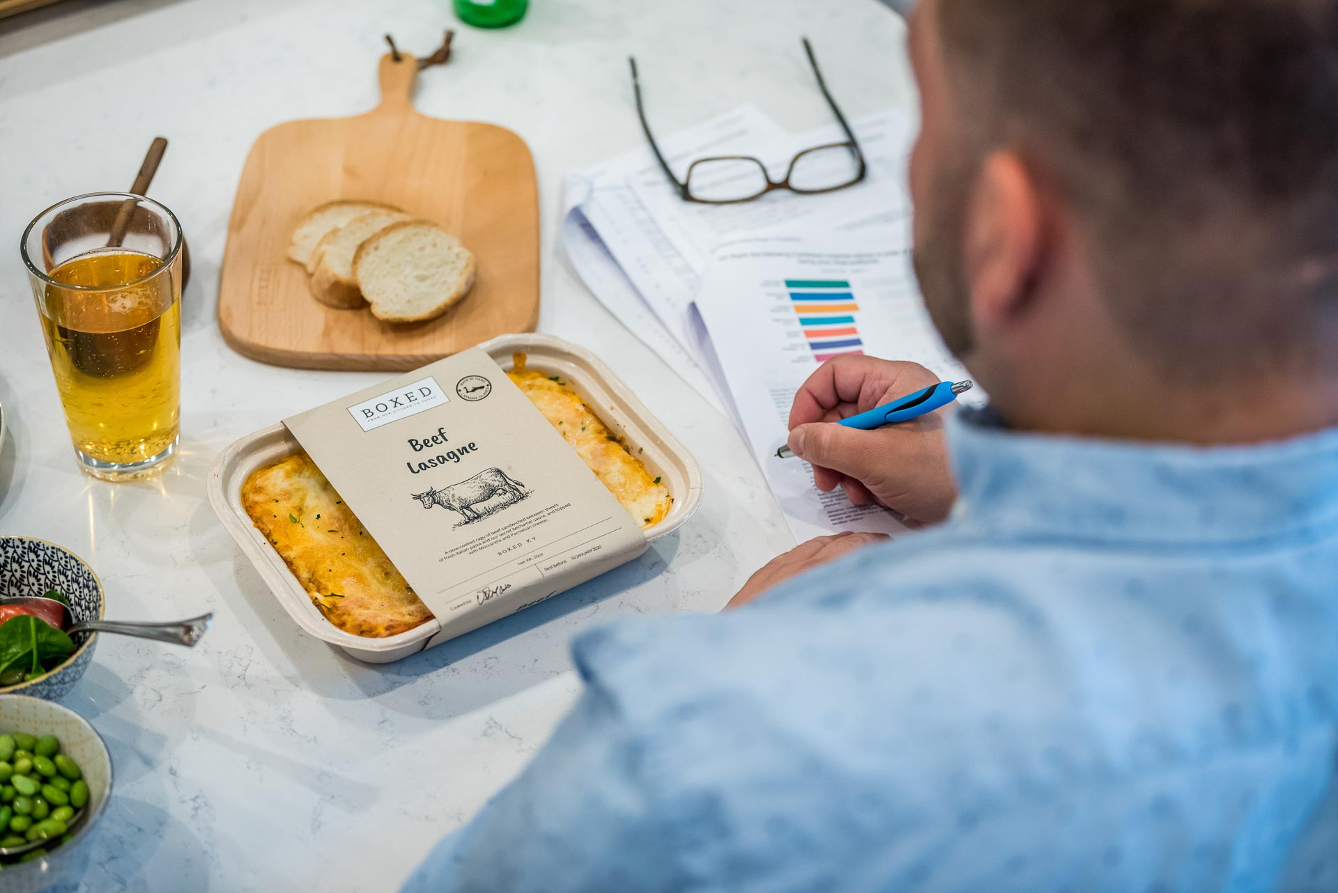
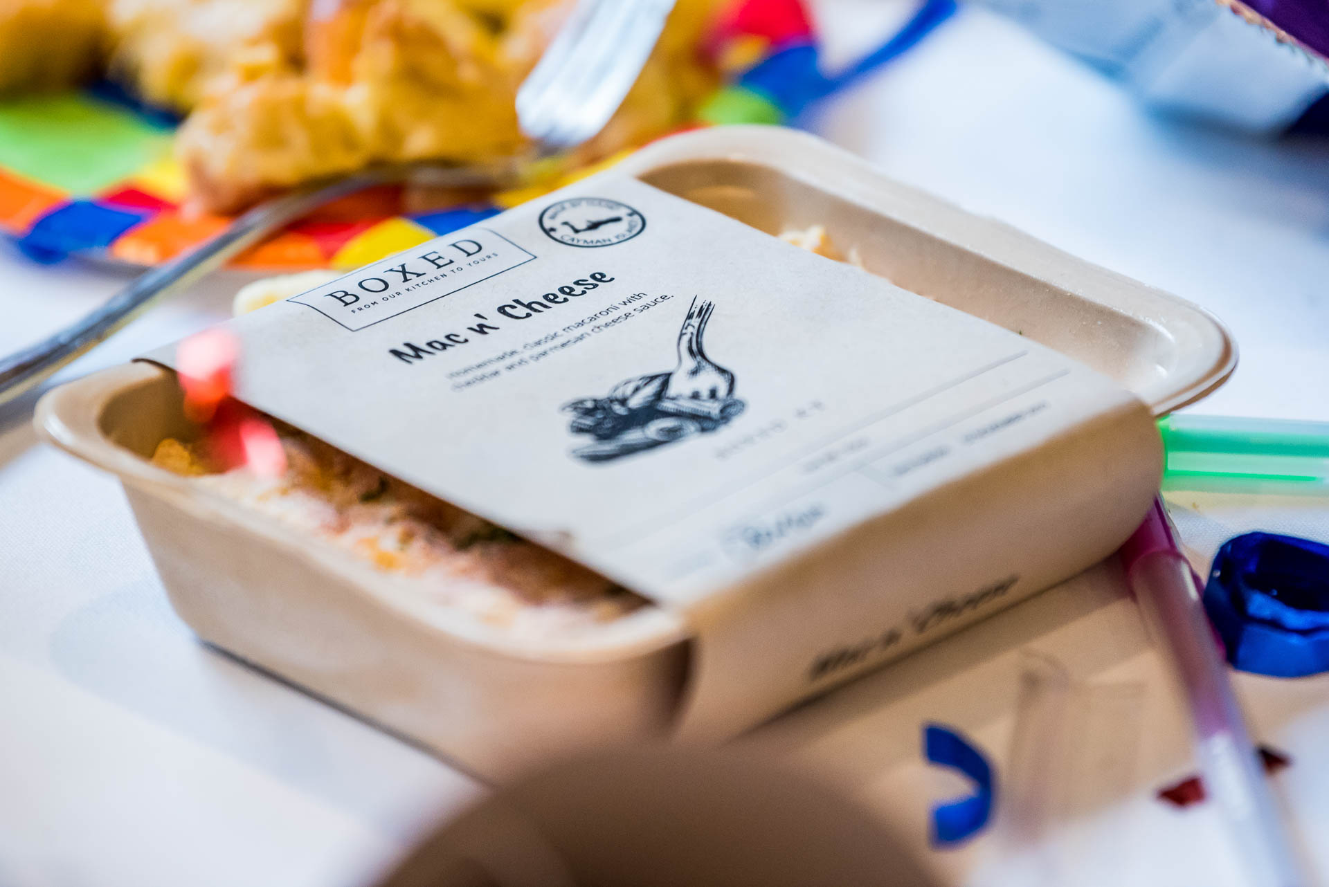
Big Panda has created a new brand identity system for Boxed that positions it as the ready meal of choice. Stripping off all the visual noise typically seen in frozen ready meal branding, the new identity deploys minimal graphic elements — the logo and a decisive two-tone color palette — that reflects the purity of the ingredients, and a colorful visual language that stands out in stores and looks great on social media.
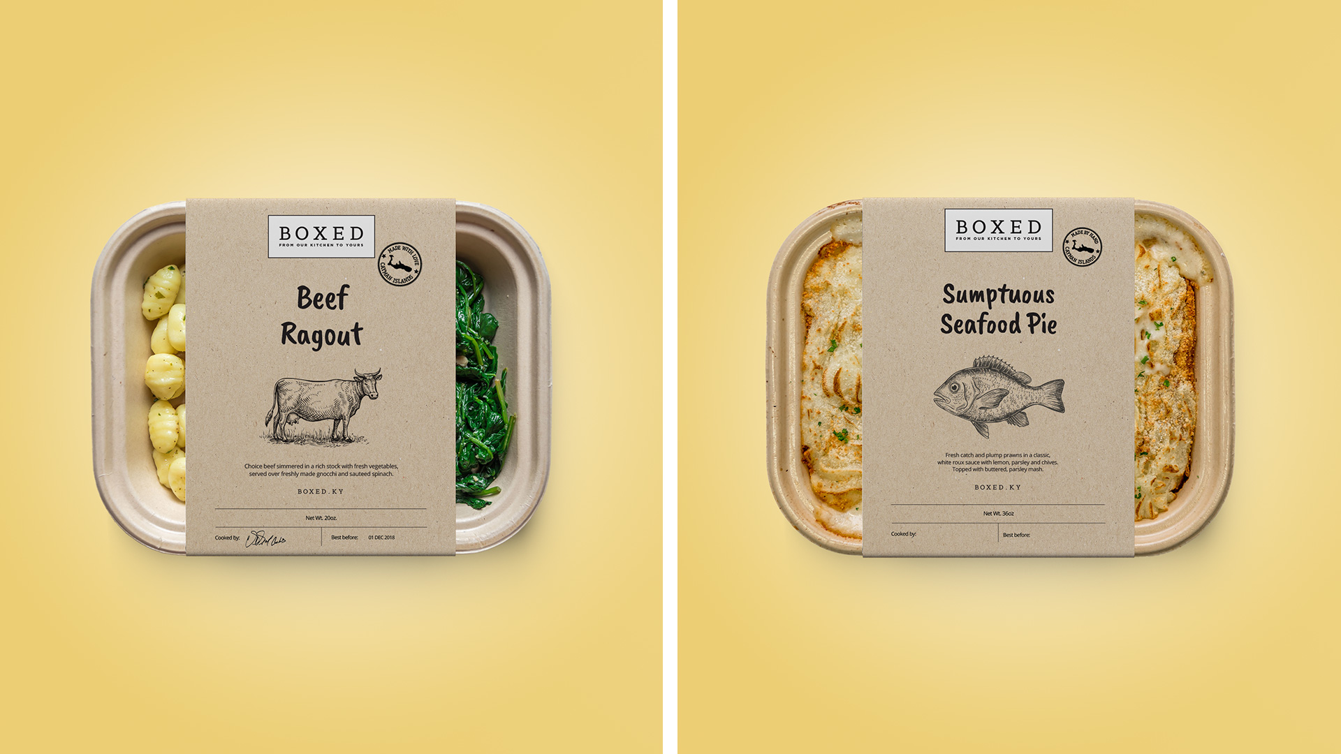
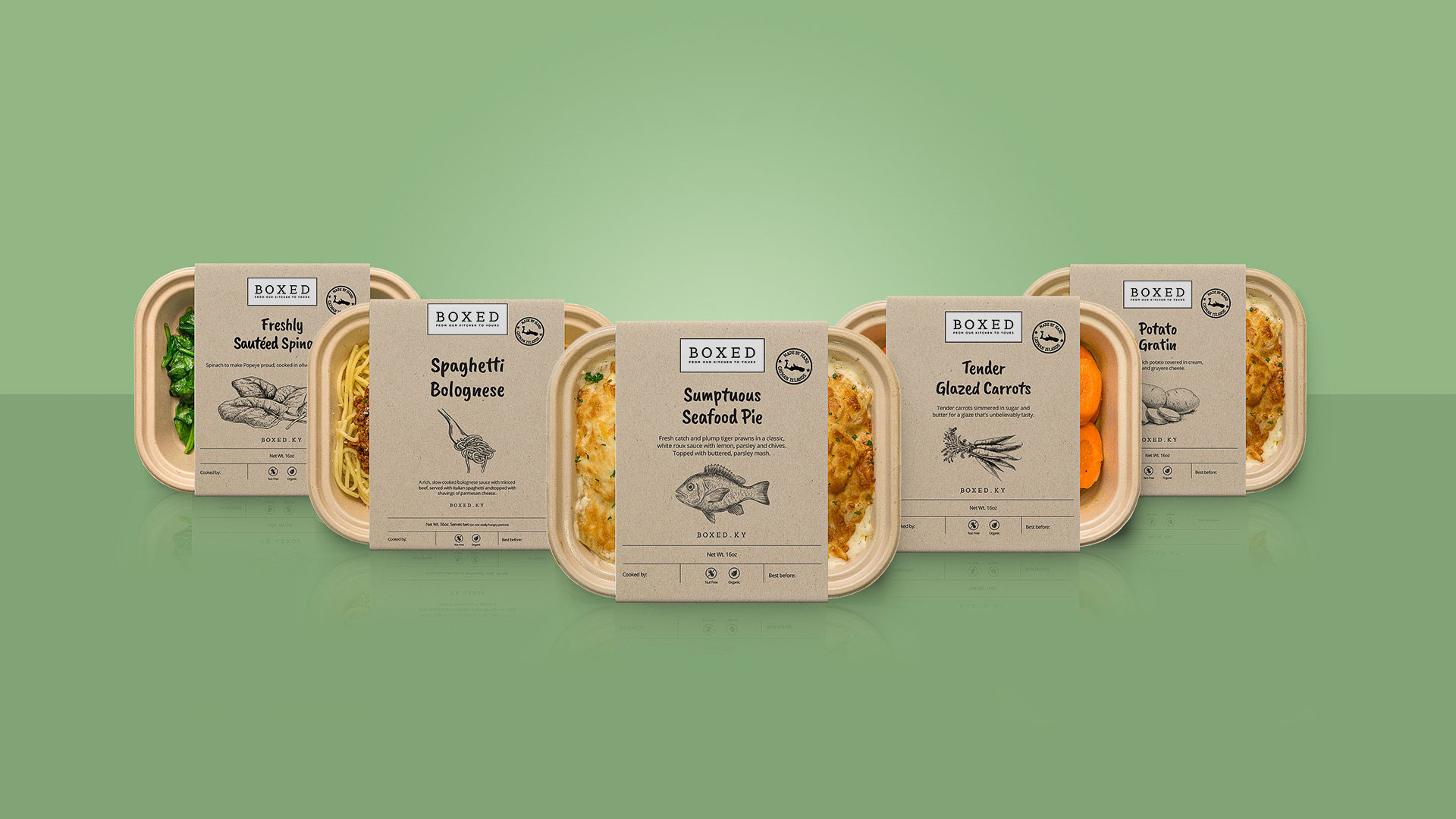
The market for frozen ready meals has exploded in recent years. The creative challenge was to create a unique positioning, visual identity, packaging, and launch campaign for a start-up food brand in the frozen food category already well served by traditional brands. Boxed needed a strategic framework and brand strategy to communicate the brand’s positioning in a meaningful way. This would inform packaging design to not only create a new local category but to bring the Boxed range to life in a crowded aisle.
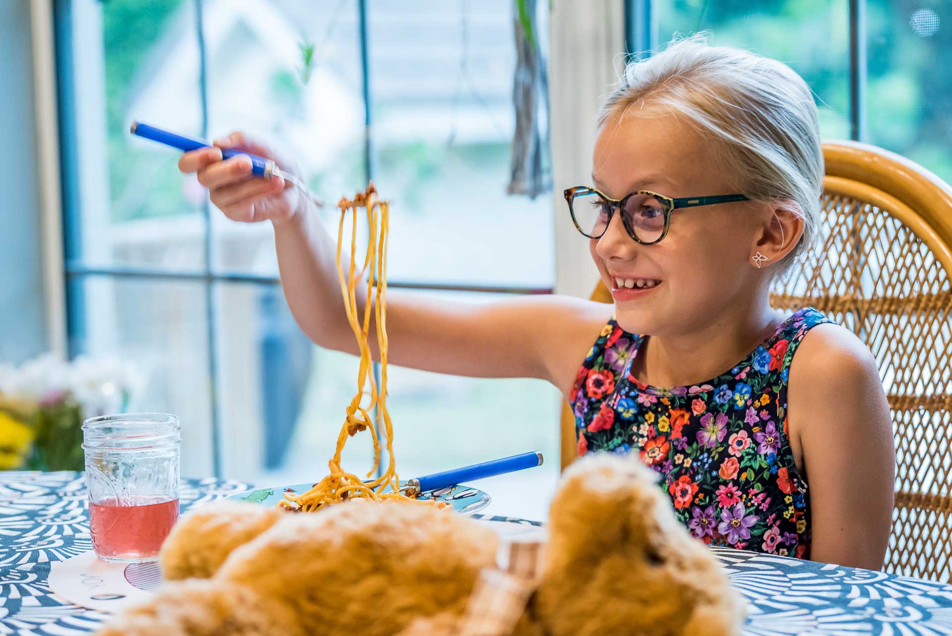
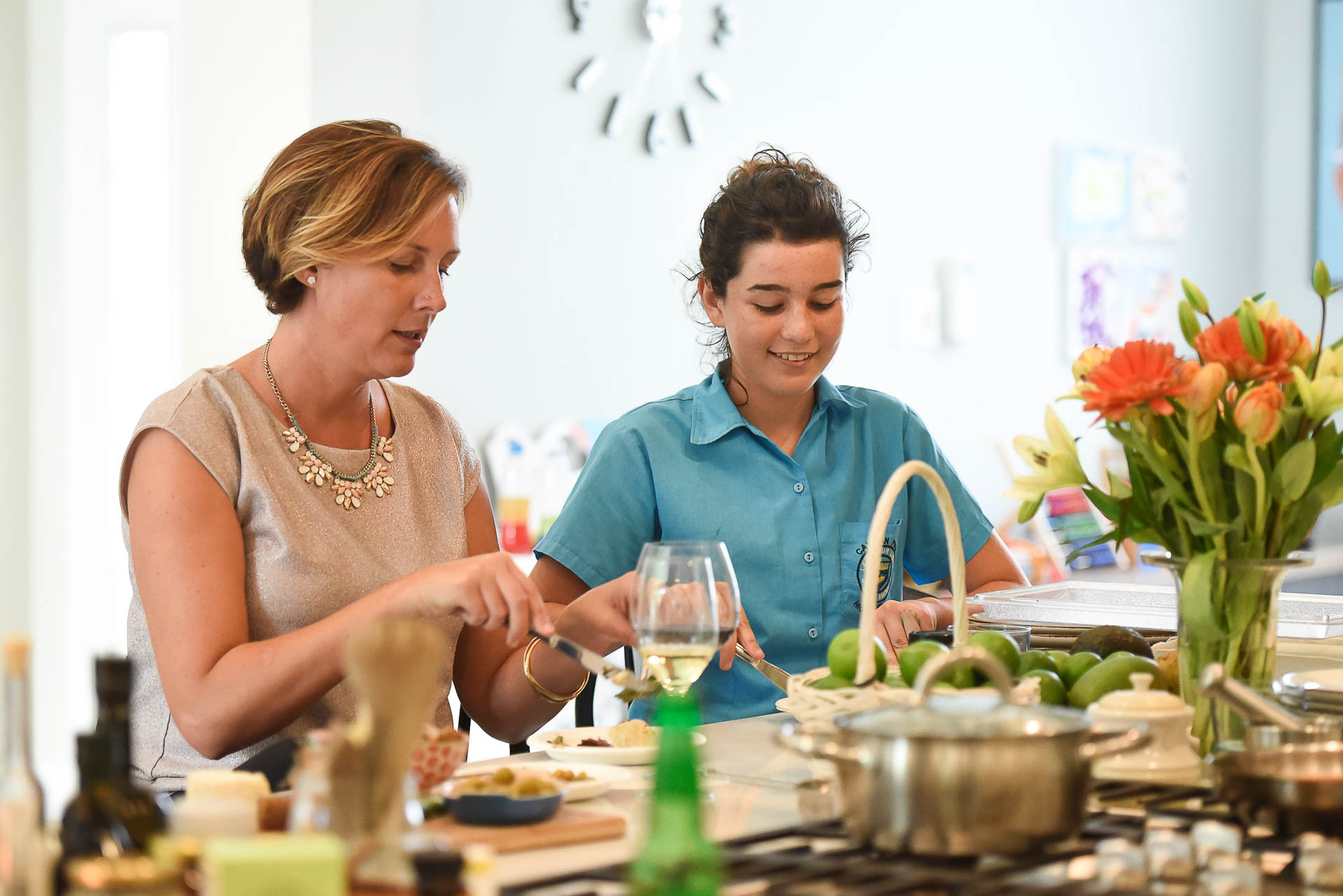
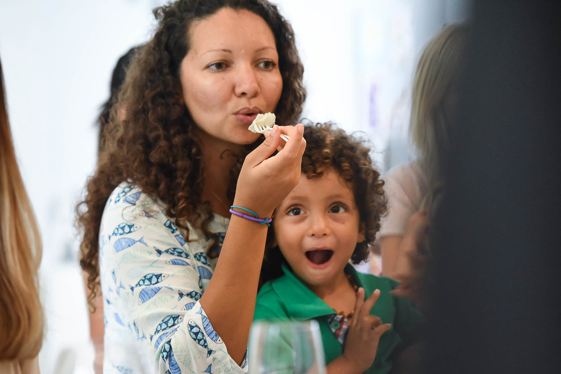
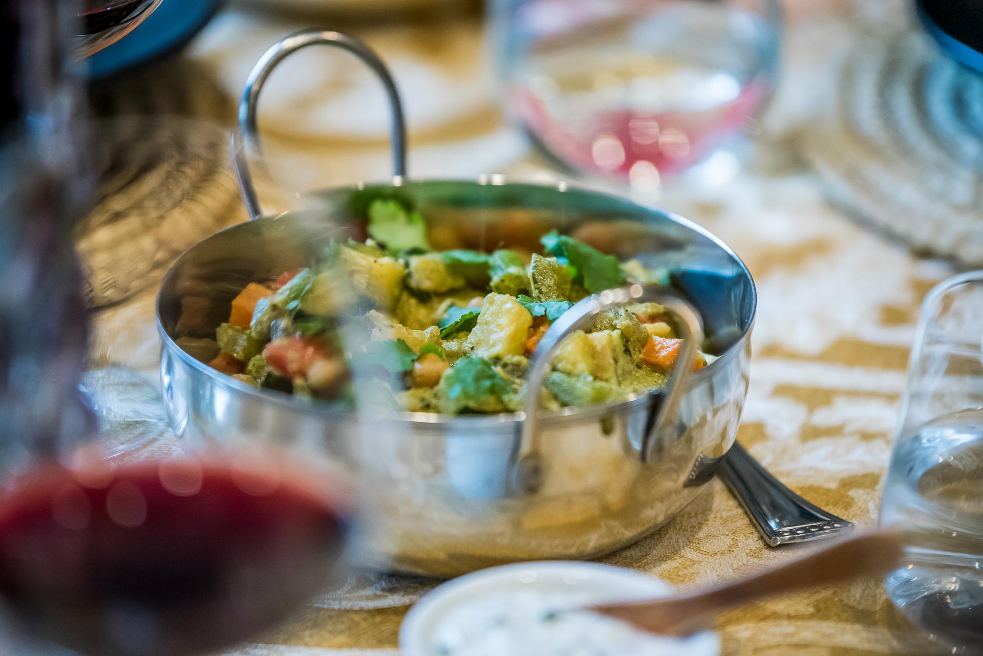
The design communicates the local quality and homemade ethos of the brand while delivering on its authenticity. To create clarity and simplicity for consumers across the entire portfolio and experience, Boxed aligned its new products with their positioning. A unifying idea provides depth and breadth for their rapidly evolving product line “From our kitchen to yours.” In addition, snappy messaging delivered with a friendly tone and style presents the product benefits with clarity and consistency.
ClientMise en Place | BoxedServicesBrand Identity, Packaging, Photography, AdvertisingYear2018Linkhttp://www.boxed.ky

