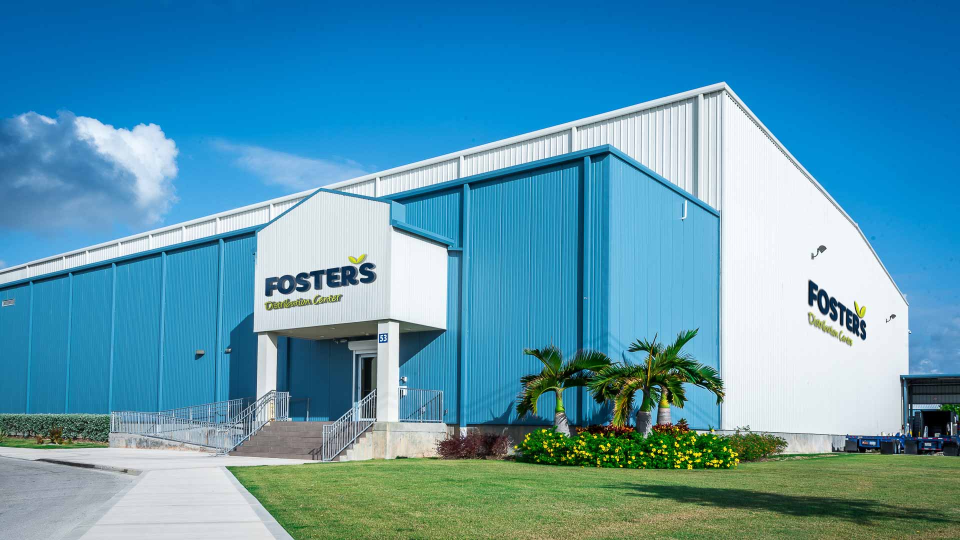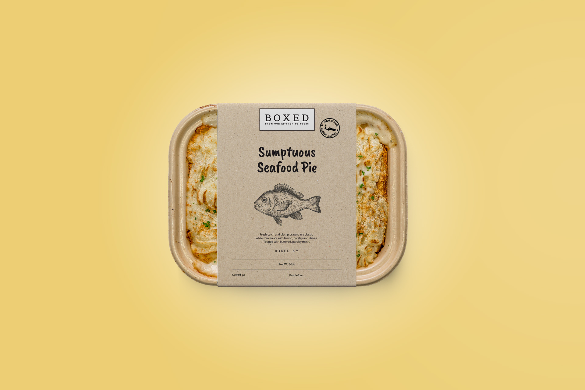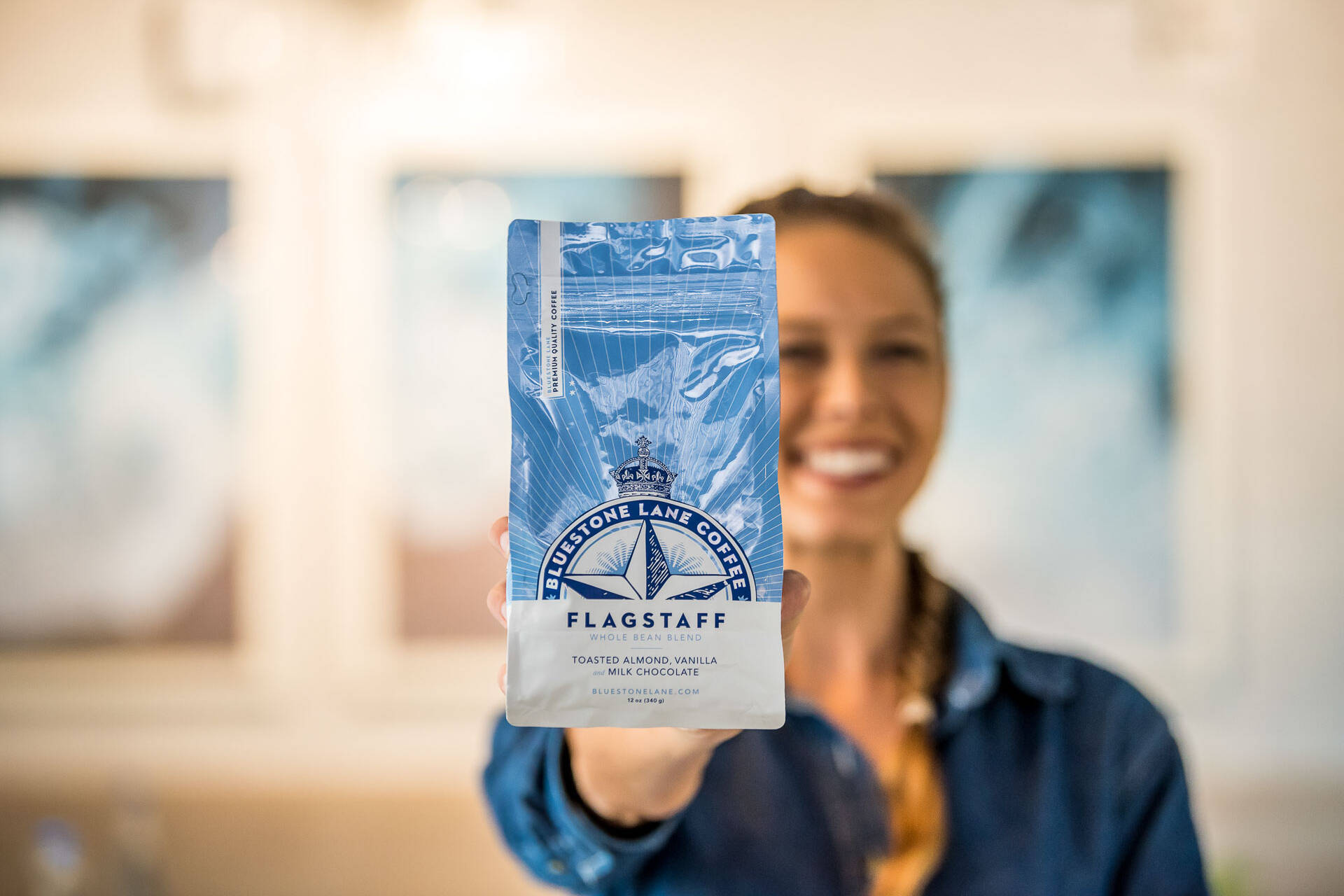

Foster’s | Brand Identity
Big Panda has devised a brand strategy and visual identity for Foster’s, Cayman’s leading supermarket group. Founded in 1980, Foster’s means more than a supermarket. It’s a foundation for success and inspiration. A thriving pillar of the community, it is built on the premise of the “We Care” promise.
The vision behind Foster’s was conceived by David Foster. With the aim of bringing a world-class supermarket experience to the island, many residents remember the buzz of the Saturday morning shop at Foster’s Airport that united a community. As demographics shift and food cultures have evolved evolve, Foster’s once again had aspirations to connect its vision, culture, and brand to a forward-thinking Cayman.
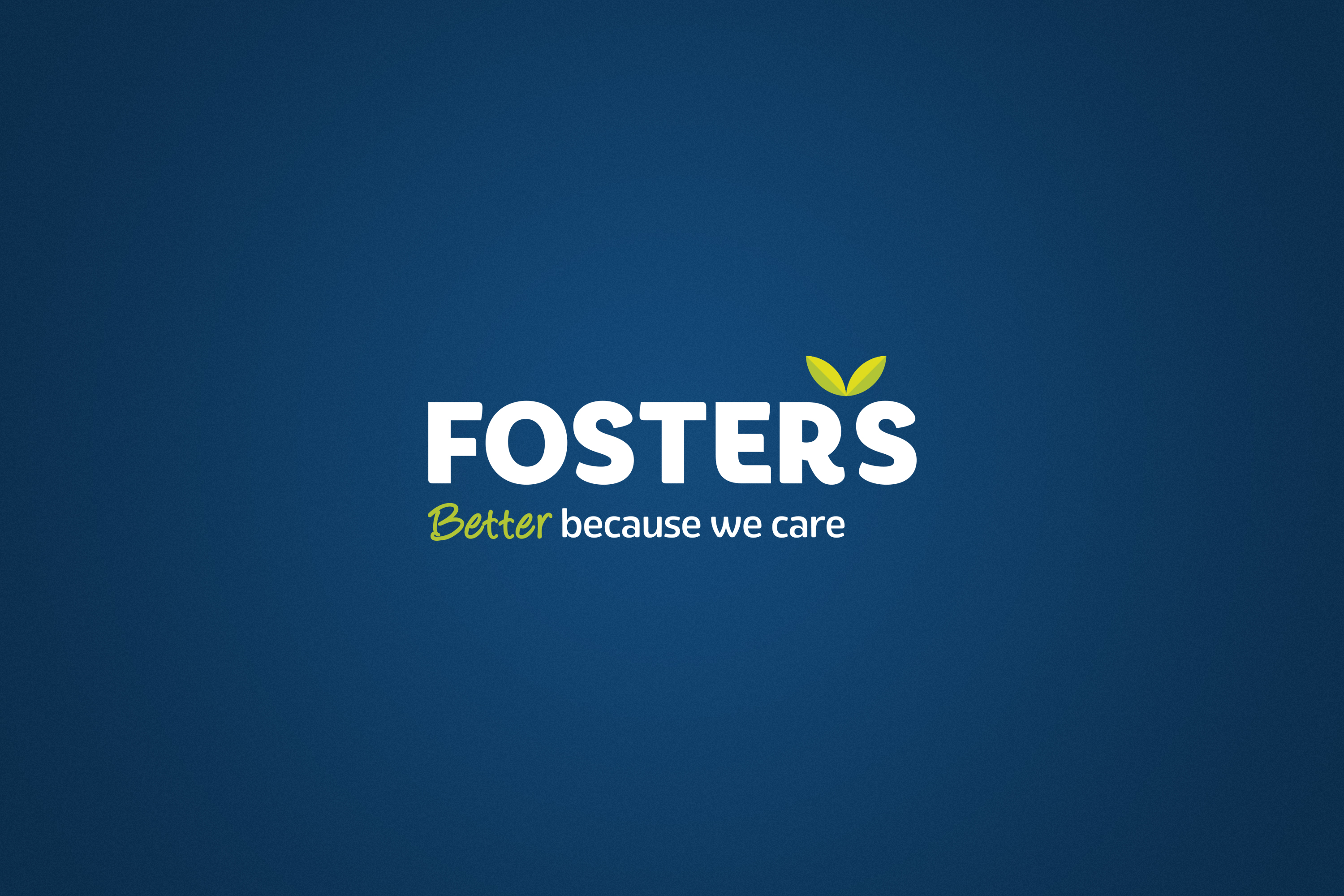
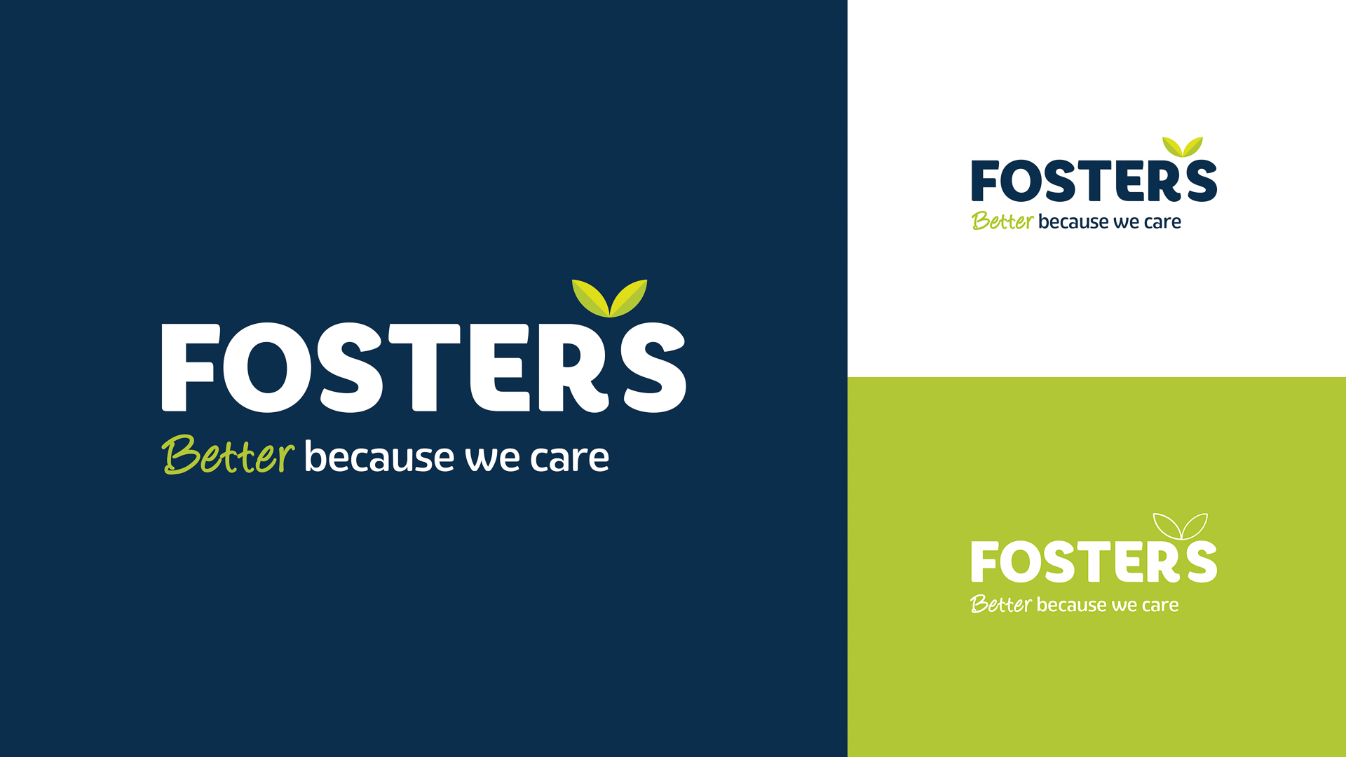
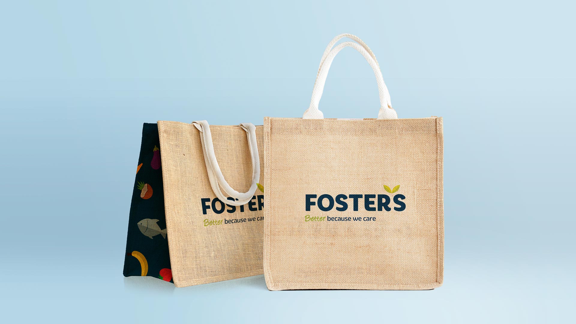
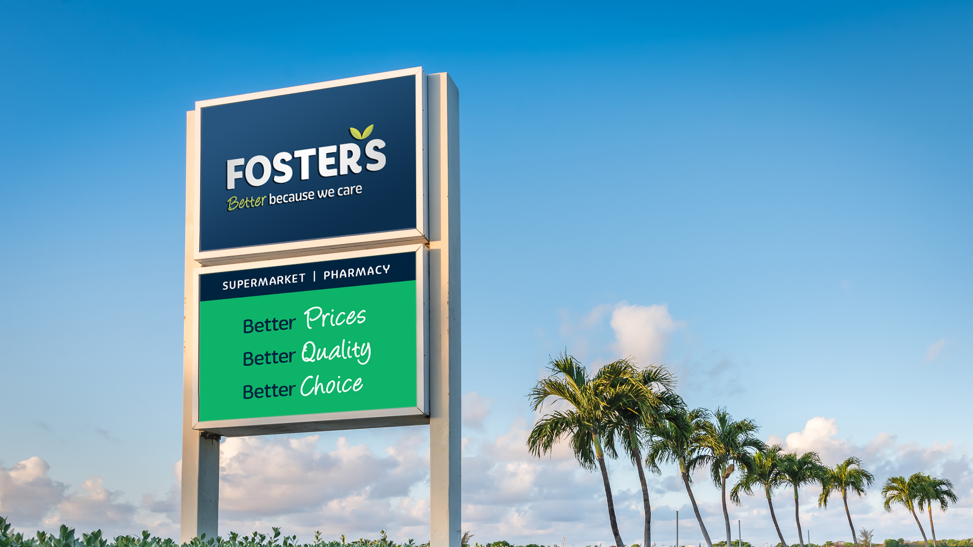
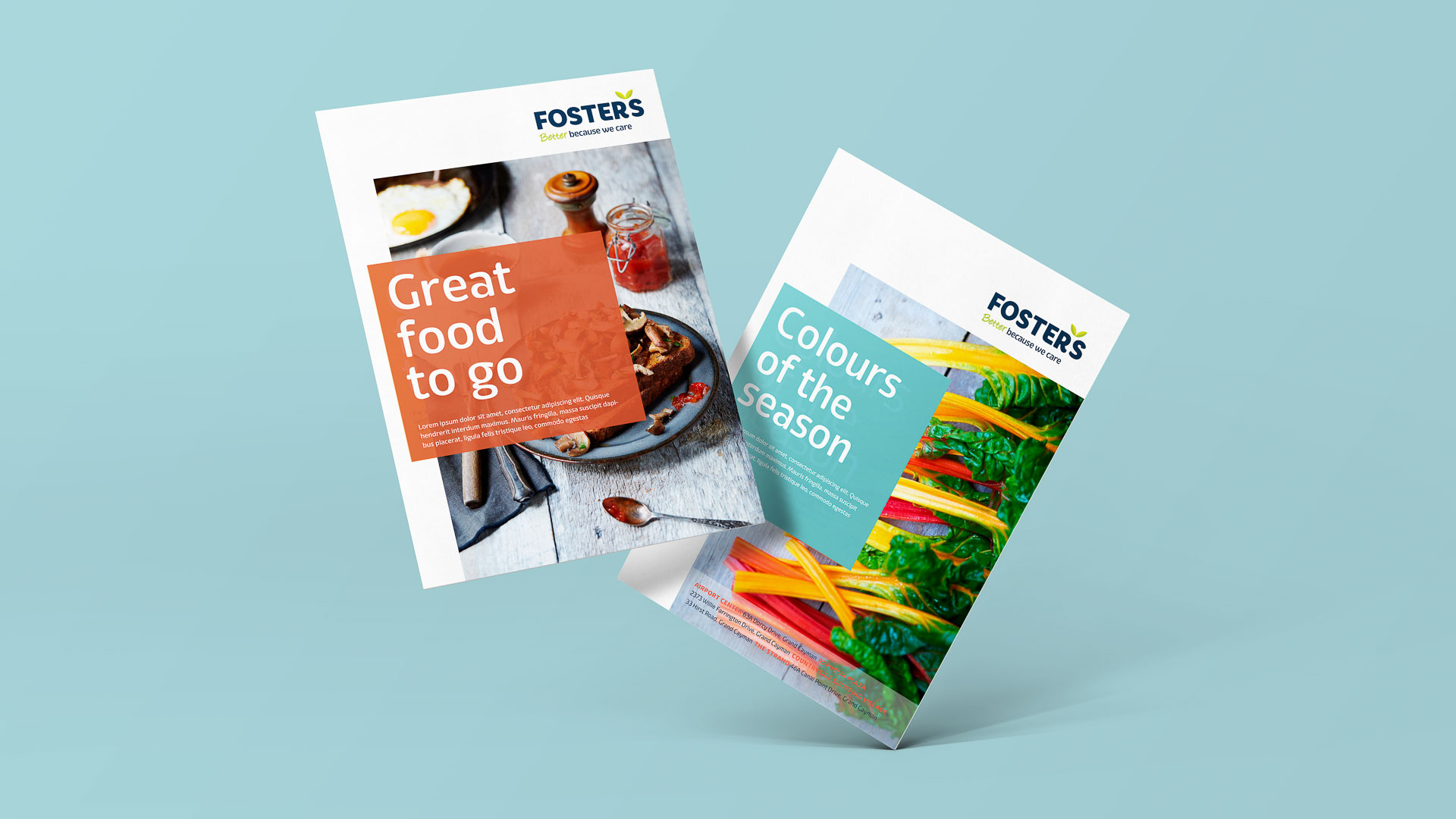
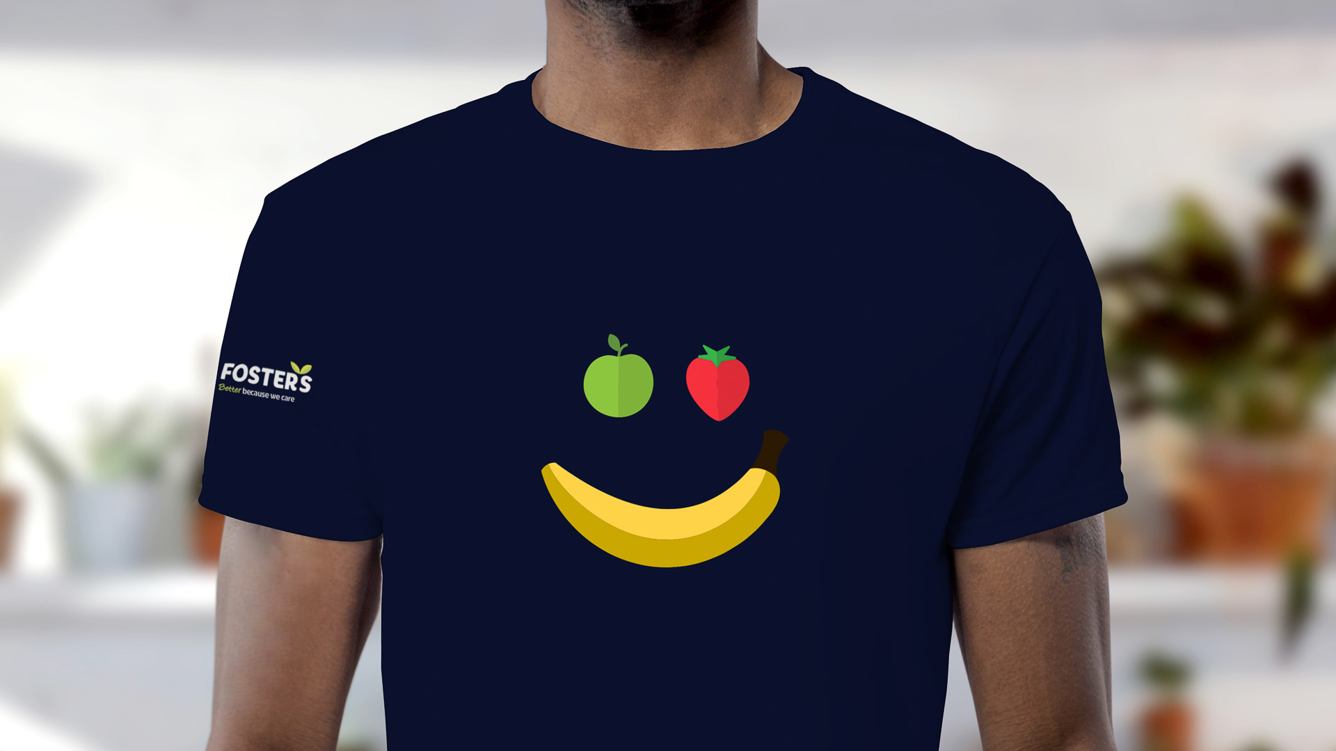
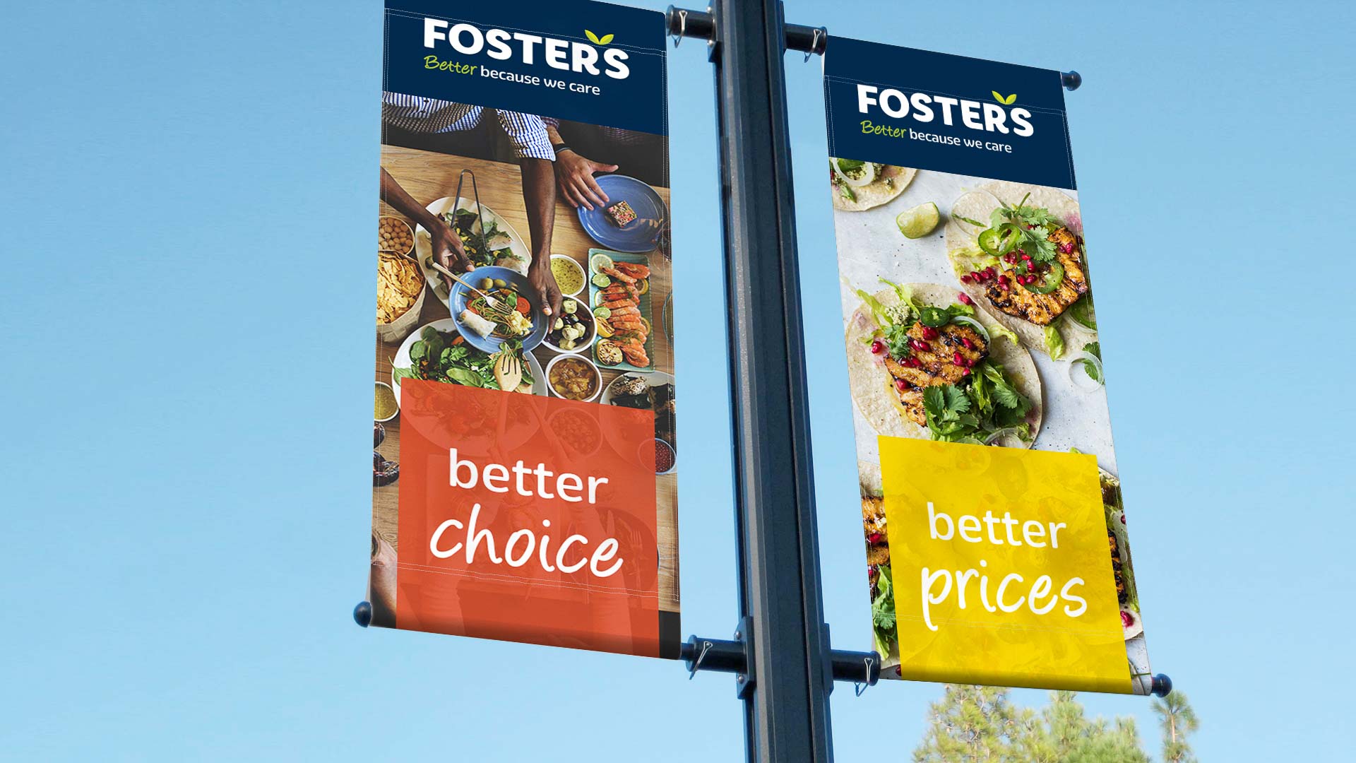
Big Panda worked with senior members of Foster’s team and members of Foster’s board to develop a future-focused strategy for the supermarket. Big Panda’s solution is based on the notion of ‘Better because we care’ a positioning that is both authentic, powerful, and unique.
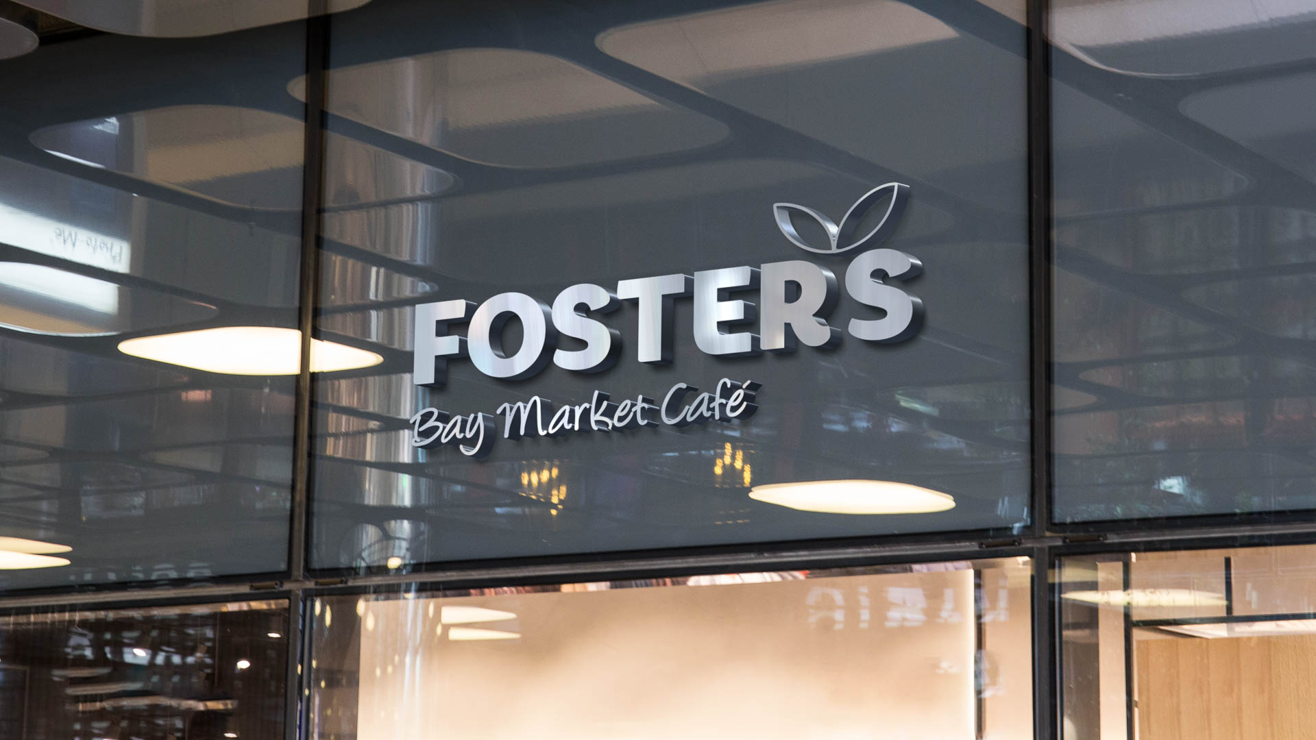
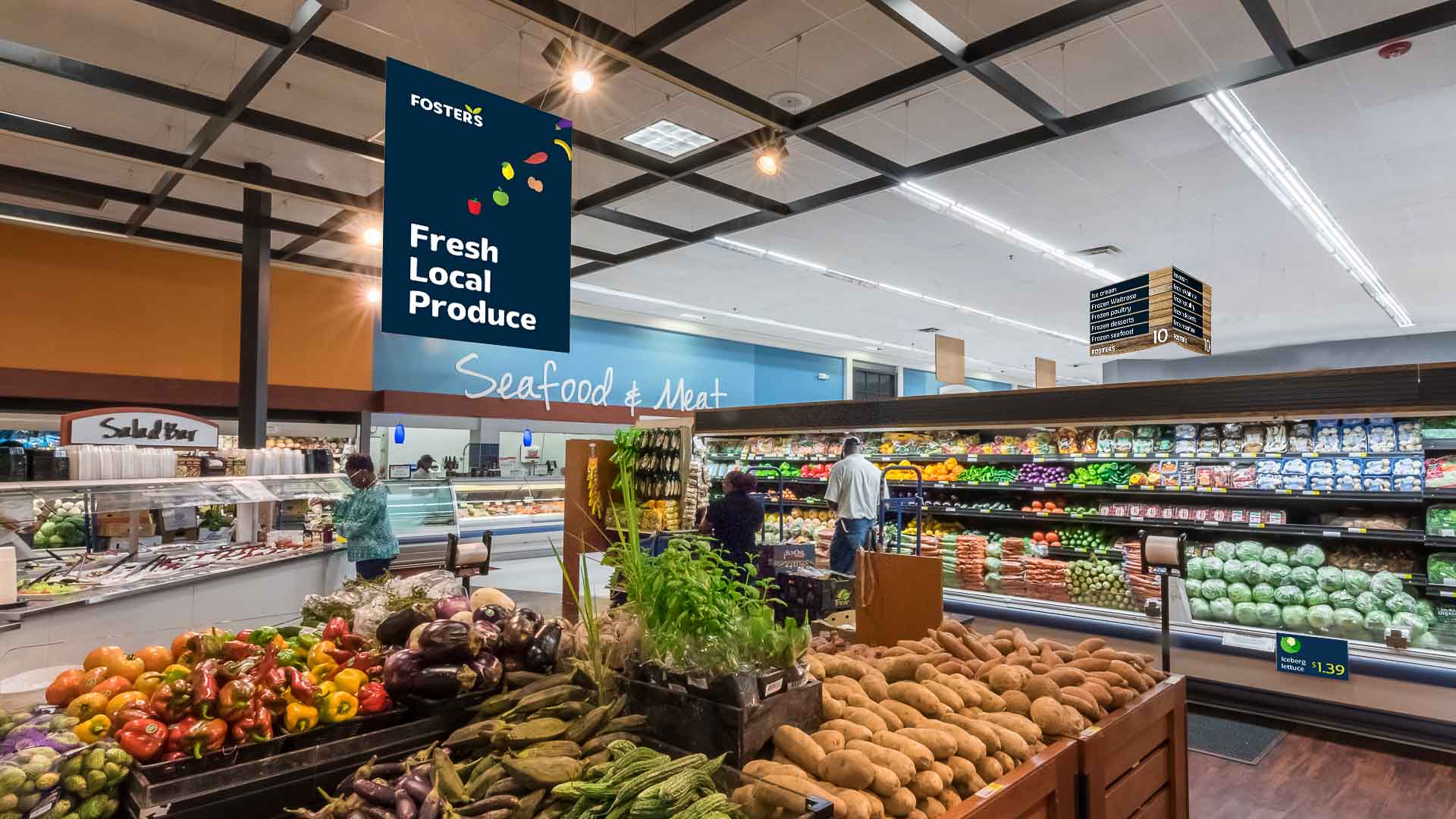
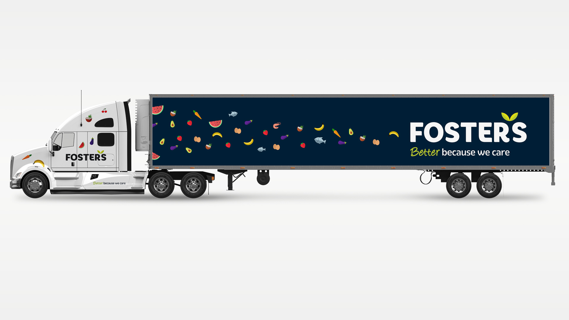
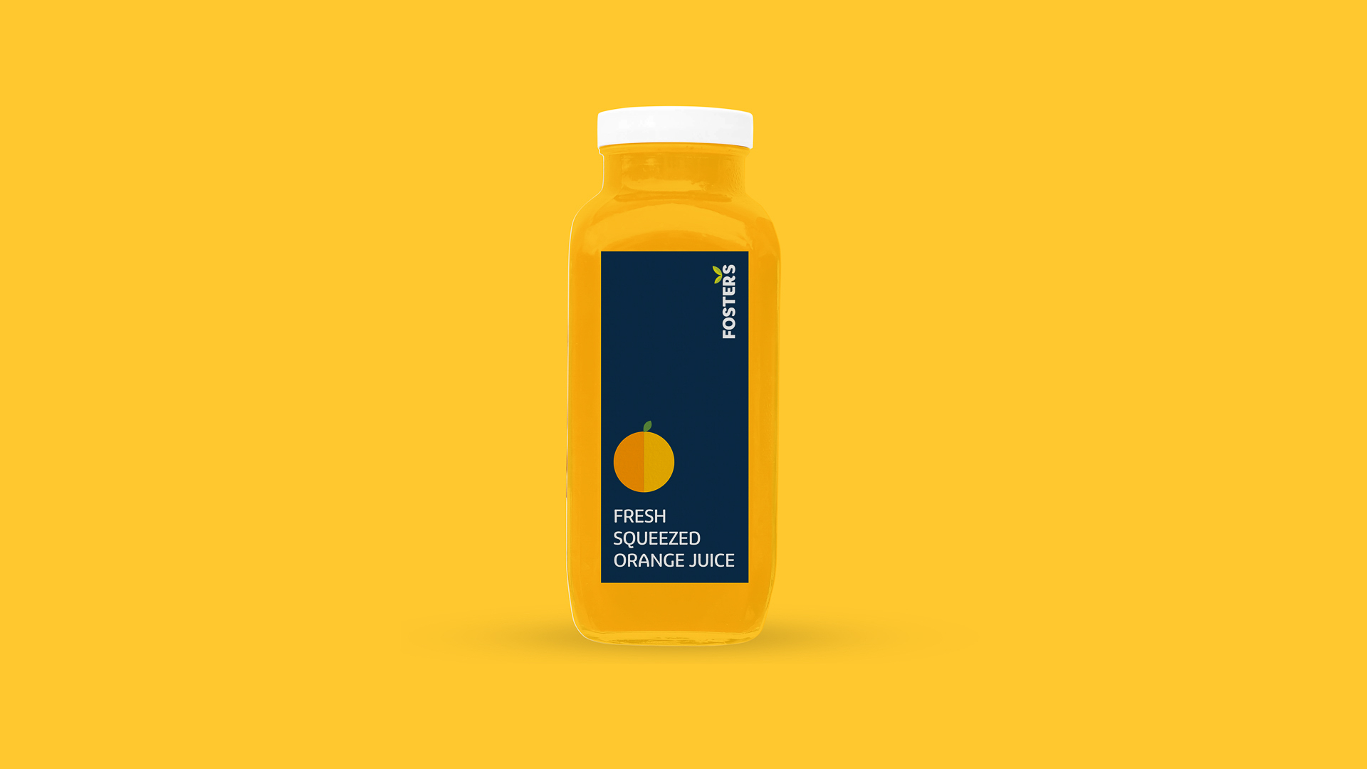
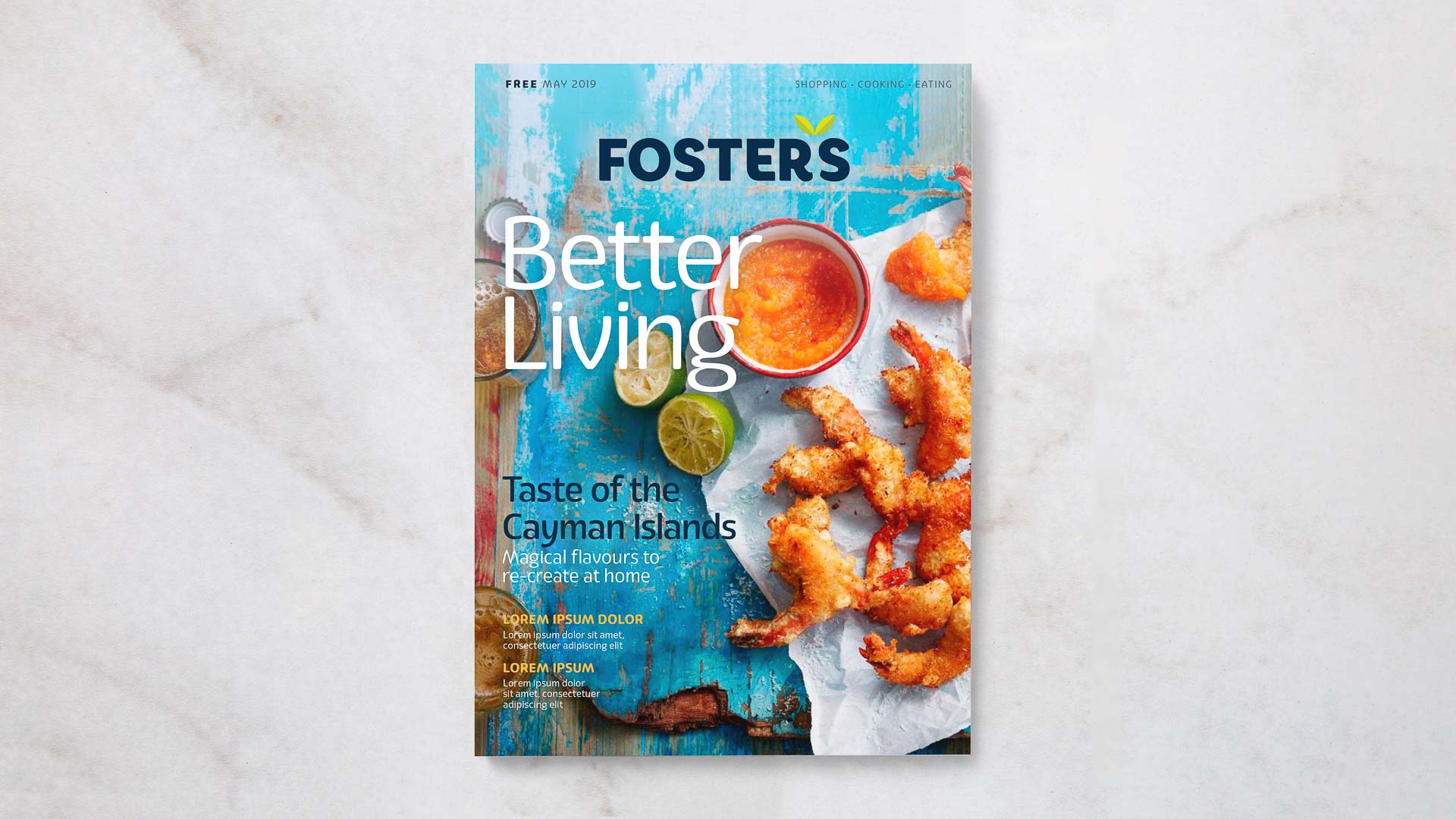
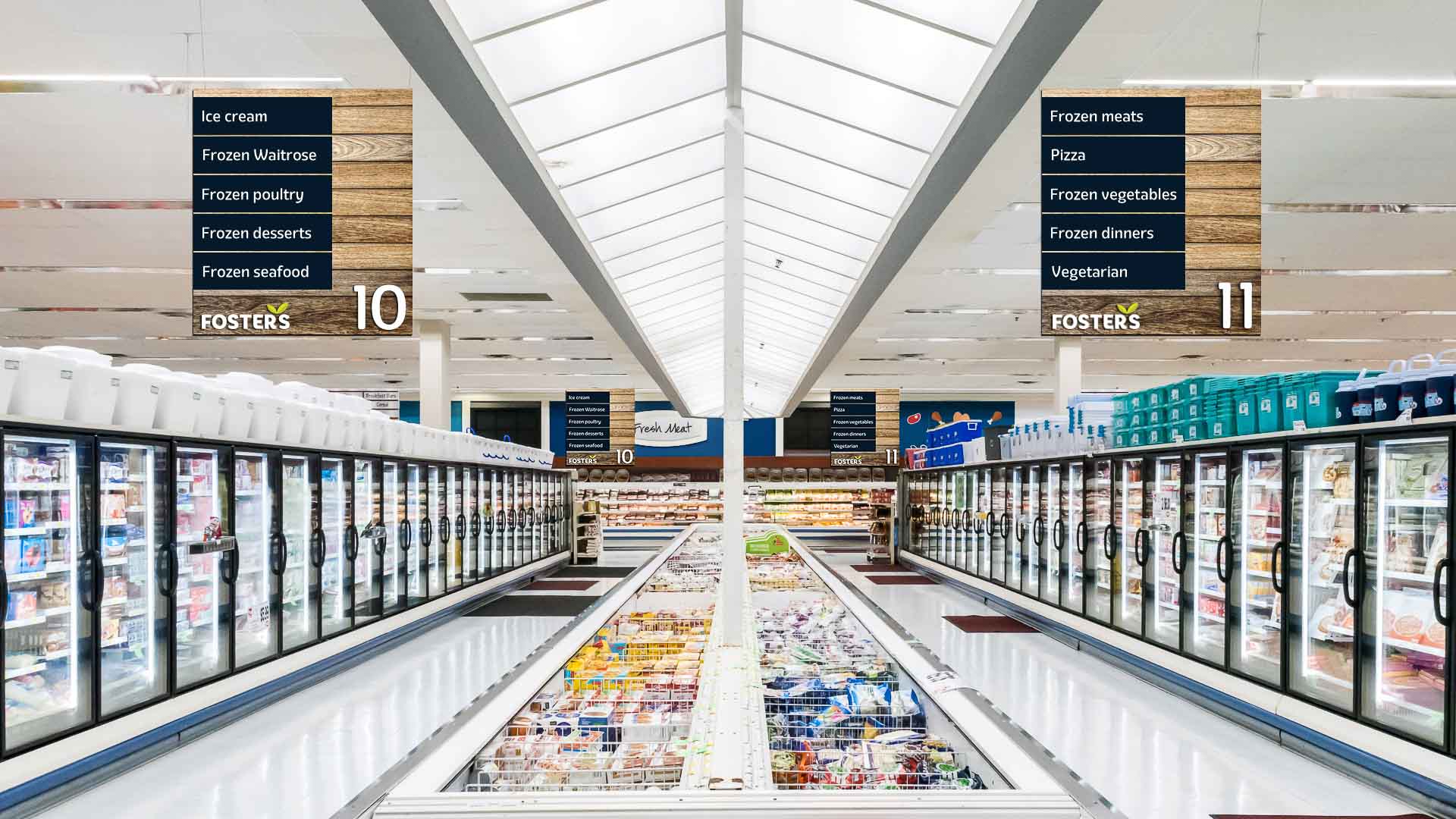
The visual identity furthers the brand strategy, building on the reputation of ‘care’ by developing a visual metaphor that is reflective of the positioning. The logomark strongly infers caring hands and using a new colour palette of greens contrasted against a confident blue, the result is a bold yet friendly wordmark that inspires warmth, confidence, and trust.
ClientFoster'sServicesBrand Identity | Brand PositioningYear2019Linkhttp://www.fosters.ky